Logotype Concept
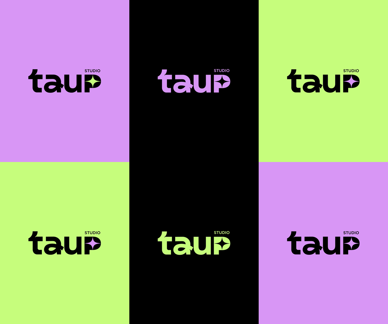
When creating the typeface, we took into account the sound of the letters "a+u" in Portuguese, which have a circular quality to them, similar to the letter "L" in English. We also considered the sound of the letter "P" at the end of the word, which has a popping sound.
Objetivo
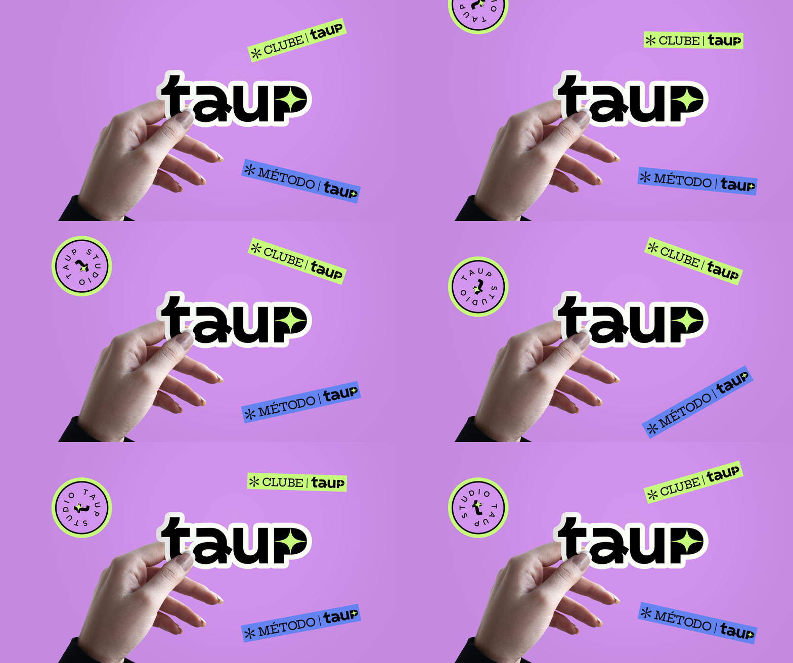
A criação da identidade visual da Taup, teve como principal objetivo, transmitir alegria, diversão, energia, mas também autoridade, sem infantilizar. Taup se apresenta como uma marca moderna, cool, nerd, criativa, com um toque de humor. Por isso, a escolha das cores, elementos visuais, traços das tipografias, foram fundamentais para remeter a esse universo.
Goal
The primary objective of creating Taup's visual identity was to convey a sense of joy, fun, and energy while maintaining a sense of authority and professionalism. Taup presents itself as a modern, cool, nerdy, and creative brand with a touch of humor. As such, the choice of colors, visual elements, and typography styles were crucial in creating a consistent visual identity that conveys this unique brand personality.


